Landing page redesign for a private client to improve onboarding, overall user experience, and visual design for a mathematical proof educational site.


My Role
UX Design
& Research,
Visual Designer
Scope
Research & Discovery
Website Design
UX Improvements
Visual Design
Tools
Figma, Figjam
Adobe CC
Vibe Coding Tools
The Challenge
The client has put in 10+ years of research to build his site, a compilation of free and open-source educational math tools. He wants to share his knowledge but Prooftoys.org remains undiscovered and underutilized.

Original Landing Page

Original Proof Builder

Discovery
There were multiple types of discovery. Discovering the client's vision, the market and audience needs, and UX and usability. There were many math calculator and math learning sites but most are function-first and usability was unrefined.
Goals
#1 Improve user onboarding
#2 Increase user engagement
Key Questions
What does the math community want?
Who is it useful for? Students, professors, professionals? And how would they use it?
Tasks Completed
-
Heuristics Evaluation
-
Market research
-
Competitive Analysis
-
User Interviews
Limitations
-
Researched US websites only
-
Analysis was done as a solo designer

Competitive Analysis
By auditing a variety of math education sites, we identified UI patterns that make complex concepts more digestible. While no direct competitor exists as a proof-centered tool, we gained valuable insights on effective onboarding and mental model mapping. One goal is for the new landing page to feel familiar to users while keeping it useful and engaging to encourage exploration.


Key Insights
-
Effective onboarding
-
Low barrier of entry (accessible to all)
-
Small bits of information
-
Clean site architecture where topics are organized
-
A clear CTA
-
Choices for exploration
-
Interactive learning
My client preferred the visual impact and simple UI of Brilliant.org. The site offers users to learn by doing and have some fun along the way, which was a key goal as well.
User Interviews
The research phase focused on quality over quantity. By interviewing five participants specifically vetted for their interest in mathematical logic and proofs, we were able to move past general surface-level feedback and pinpoint the exact pain points that advanced learners face.

Main Pain Points
Deeper Concepts
Can't find a resource that explains reasoning behind the math in a digestable way
Accessible
A lot of math sites are not user-friendly and difficult to use
Transparency
Don't understand the intermediate steps in problem-solving
Key Quotes
Discovery
Step-by-Step Learning
“You need one thing to be slightly useful or fun, and then you’re willing to entertain the possibility that there’s something else for you there… maybe people aren’t ready for this all at once.”
Discovery
Learn by Doing Math
“I like to understand the deeper reasoning behind concepts and I enjoy making mistakes and learning through the process of trying different things. Proof assistants could be more accessible with better design”
Personas & Use Cases

Design Exploration
Some vibe coding iterations geared towards professionals and students and professors
lovable.dev

replit

lovable.dev
Content organization and user onboarding exploration in Figma


Branding
Logo Redesign

Custom Icons

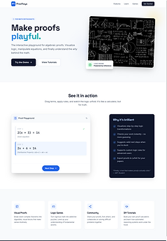
I redesigned the logo to a modern and professional look, adding accent colors for playfulness. Button icons were created as a visual cue for the topics of interest for the user to start exploring from the splash page. The new design system unifies the look of the site. Ultimately, existing typefaces used for proof calculations remained for clarity and accuracy.
Design System


Lessons Learned
Importance of systems thinking: early collaboration with developer to ensure design to dev handoff is smooth and low maintenance
Explore more. adjust to change and don't follow a plan: new ideas and pivots happen often so it's best to approach them as turns on the journey and not roadblocks. Stay flexible but keep your eye on the goals.
Listen to what the client wants but give them options they weren't expecting to break assumptions and spark visions. (This is a given but truly important for creative roles)